 |
| Good wages didn't come easily, even in the 1950s. |
Those hard-fought victories include aspects of American life that we've framed as the American Dream. Americans today are decrying the loss of the American Dream, and those on the left blame it on anti-union and anti-labor sentiment, while those of the right claim that it's because we lost our sense of personal responsibility and 47% of us are takers.
The funny thing is that during all those years, we elected Democrats -- like Truman, Kennedy, Johnson -- and Republicans -- like Eisenhower, Nixon, Reagan -- with equal enthusiasm. The turning point, however, was the ascendancy of Ronald Reagan, who ushering in the era of anti-unionism with his handling of the PATCO strike, where he singlehandedly broke a major union. He did this while gathering disaffected blue-collar workers who then became known as Reagan Democrats.
The irony is that the man who brought blue-collar workers into the Republican fold was the same man who vowed to destroy labor. Every since then -- most economic historians mark the beginning of Reagan's first term as the beginning of 30 years of declining wages -- labor has not only lost power to capital but has also lost tremendous wealth to the upper quintile, the upper 5%, 1%, 0.1%. Any way you view it, capital is kicking labor's ass.
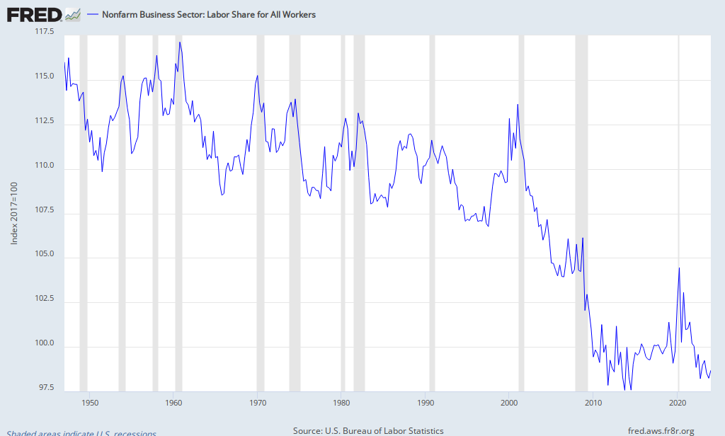
This chart from the St. Louis FED shows labor share of income falling beginning in 1980, except for the period marked by the tech bubble during the Clinton years:
This is all the more surprising because labor productivity has risen steadily throughout the whole period:
Kenneth Thomas, political-science professor at University of Missouri-St. Louis, whose blog is where I found these charts, explains it well:
An even bigger problem is that the compensation series includes all workers, not just average workers, so it lumps CEOs and janitors together in a single measure even though we know that the 1% soaked up most of the income gains before and after the Great Recession. Moreover, the nonwage portions of compensation, such as health insurance and defined benefit pensions, have eroded much more for average workers than for the 1%. Thus, this measure is completely unsatisfactory for understanding what has happened to the average worker.This is not the first time this has happened:
So, we come back to Table B-47 and the real wages of production and non-supervisory workers. The fact that, adjusted for inflation, wages still remain almost 14% below what they were 40 years ago, despite a doubling in productivity, is a national disgrace. It is one of the roots of the increase in multi-income households, in higher levels of indebtedness needed to maintain consumption levels, and of the sharp increase in inequality we have seen over recent decades.
Compare 1923-1929 with 2002-2007. We had serious crashes after both 1929 and 2007.
Can anyone possibly imagine what will follow if we can't cure income inequality?
Now, in simplest of terms, how do we describe such a situation of income inequality as illustrated in these graphs? I describe it as a disparity between capital and labor. We can talk about how the upper 1% have all the money, but that's not as helpful in illustrating the problem. Let's just call capital the upper 20% (with the top 1% of that having most of the wealth) and labor the bottom 80%. The solution to income inequality is redistributing wealth down from the top 20% to the bottom 80%.
How do we do that? By empowering labor over capital. Who does that best, historically?
Labor unions. Strikes pressing for a living wage are a good start. Go labor!


No comments:
Post a Comment